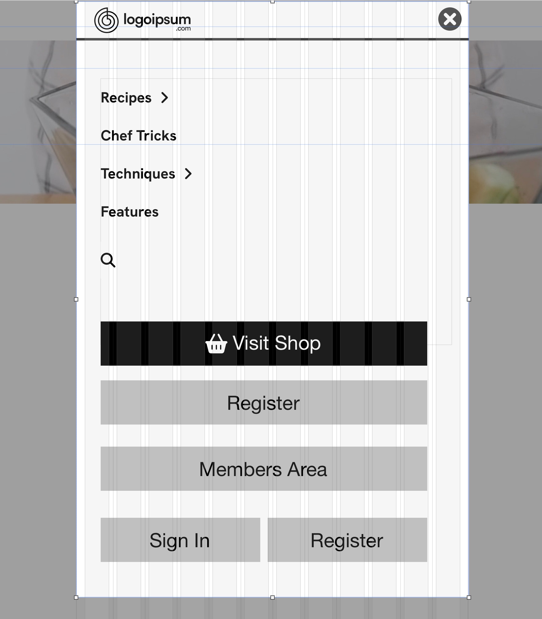
In the mobile version of the site, the main navigation bar has been replaced with a customized compact menu which is activated by the icon in the top-right of the screen. Clicking this icon will open a popup menu, just like in the desktop site. It contains all the links that we have in our desktop version, plus a search function.
Clicking on the recipes or techniques links will open other popups, each containing their relevant links. If the back button is tapped, the main menu popup appears again. All the popups have the same Group ID, so only one of the popups can be displayed at a time.
Mega Menus in Layout Blocks

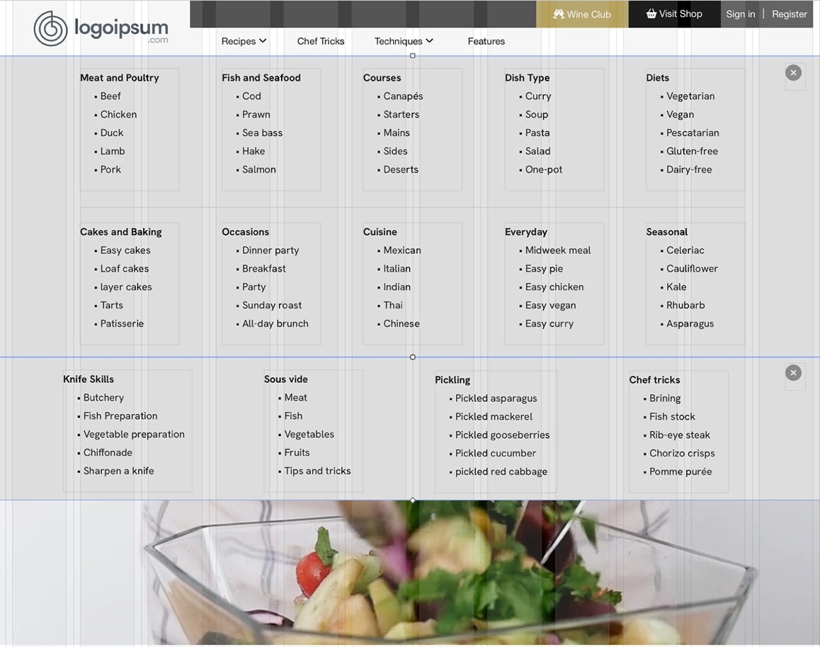
On this page we demonstrate how mega-menus can be incorporated into your website as Layout Blocks. The two links ‘Recipes’ and ‘Techniques’ have been set to Toggle Visibility on two layout blocks - one named Recipes, the other named Techniques. These were created and positioned immediately below the main navigation bar above. Each of the layout blocks were positioned one directly under the other (see illustration below)
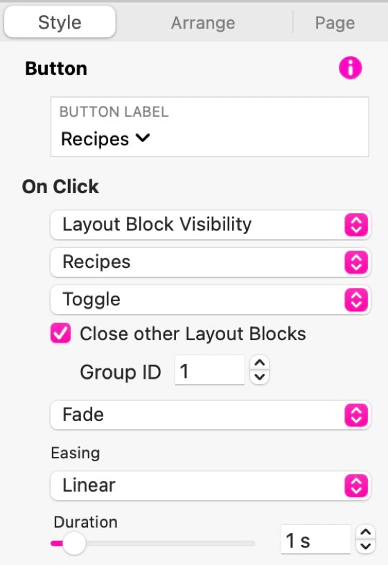
The layout blocks themselves are set to be ‘Initially Hidden’ and both were given a common Group ID - this ensures that only one layout block can be open at a time.
The navigation links have been set to ’Toggle Layout Block Visibility’ on the respective layout blocks, and the option to ‘Close other Layout Blocks’ has been checked. When selecting this option, be sure to enter the Group ID of the blocks that should be affected. In our example, we also added some animation effects as can be seen in the illustration on the right.
With this type of menu set-up, the mega-menus open WITHIN the page content, pushing other page content down the page.
If you reduce the browser width, you will see how these menus are handled on a mobile version of the page.
Arrangement of layout blocks on the page
All the popups have been positioned at the very top of the mobile page so that they cover the main logo and navigation bar at the top of the page.
Navigation Block
Recipes Layout Block
Techniques Layout Block
Page Content